I’m a touch embarrassed how long it is since I last posted some fresh material here on a blog but my feet don’t seem to have time to touch the ground at the moment. Regular followers of my work on my Facebook page will know though that I have been travelling quite extensively in recent months with a good proportion of it being in Africa in the past year or so (and plenty more to come in the next too), a relatively new continent for me to focus on photographically to this current extent.
It is a region that is dear to many as one where wildlife spectacle, scale, accessibility and opportunity abound and after a number of visits to south, west and east now I have to confess that it is beginning to truly cast its spell on me too.
One aspect of the many images that I have seen and enjoyed from the so-called dark continent is the role of monochrome in the mix. Maybe it’s a throw back to the first images from here that I gazed at as a child as they were pretty much all black and white in their nature, but I have always felt that it seems to work as a presentation better here than many other areas and it is something clearly recognised by the fine art exponents of the wildlife photography world who have focussed their work here such as Nick Brandt and David Lloyd amongst others. It was something I was keen to explore, especially what it was that seemed to make it work so well here during my travels and it provides the focus for this otherwise disparate collection.

There are of course some species such as Zebra that are naturally black and white in their markings and so stripping the colour out of this simple scene has really emphasised them.

The use of a polarising filter to really capture the drama of both setting and sky of the Maasai Mara here is another classic and obvious scenario in which the simplicity that monochrome allows can work very effectively too.

Sticking with the markings though and selecting a small section of them such as this giraffe to really show the details, and in this particular instance adding a slight colour tint as well, is an approach that I knew worked well thanks to the work of others but as happy as I was to work on these approaches I wanted to develop more of a personal checklist – when should I specifically be thinking black and white?
One of the answers is where texture of the subject is a key characteristic. Skin, especially when it is hard, leathery and wrinkled really does seem to work well – the removal of colour from these images of Elephant and Black Rhino respectively, especially the final close-up really does emphasise their texture and all its characteristics.


The same might also be said when it comes to looking for texture in the landscape too: this general scene of grassland filled with game in the Maasai Mara benefits hugely from the simple contrasts between grass and wildlife.

One of the many challenges of photographing here is the very short periods of golden light at the beginning and end of the day. It means that much photography is inevitably done in the shoulder periods just after or beforehand when the light might normally be considered to be getting too harsh. Sometimes though this can work in your favour when it comes to thinking in a monochrome way – this backlit Zebra would have have had a very washed out feel if left as a colour image for instance and I simply wouldn’t have even pointed my camera at it. Recognising that the contrasts would work well in monochrome meant it was well worth pressing the shutter.

The same applies to these running Wildebeest. Albeit that I have deliberately slowed the shutter speed down to create the sense of speed, blur and movement they were shot almost straight into the sun and the background is completely blown as far as exposure is concerned: far less of an issue when you turn it to the white element of a black and white image!


Sticking with Wildebeest, when you are fortunate enough to witness the drama of a river crossing the chances are that it too will not be in the perfect light conditions; it’s not as if it happens to order after all. Add a lot of dust into the scene along with the fact that shooting at this time of day can also play havoc getting a nice white balance to your images and the simplicity of monochrome becomes a really good option and one that allows you to be drawn into the action and not distracted by less than perfect colour.


Of course all these scenarios can work equally well in colour when the conditions are right and absolutely nothing beats golden perfect light, but realistically it simply doesn’t occur all the time so developing an eye that thinks texture and contrast rather than colour alone is a great way to begin to see things here.
In the past I have always had a simple guideline when it comes to monochrome – if it adds something to an image (i.e. it looks better than the colour version) then that is reason enough to present it in its more simple form. Working in Africa has really fine tuned that thinking for me and with the marvellous big cats to be found there more than anything.


These two male lions couldn’t be more contrasting by dint of the fact that one is clearly pretty handsome and the other has what is best described as a face more full of character. By presenting them both in monochrome their characters, as best that can be gleaned by looks alone, can instantly be compared: in colour the light, setting and the fact that the first is even more striking because of his golden locks would make this less obvious. As someone who has always been particularly drawn to the portrait side of photographing wildlife, especially mammals, this really appeals as it can make for a more engaging image and one full of personality. Lion cubs simply have all of this in abundance.


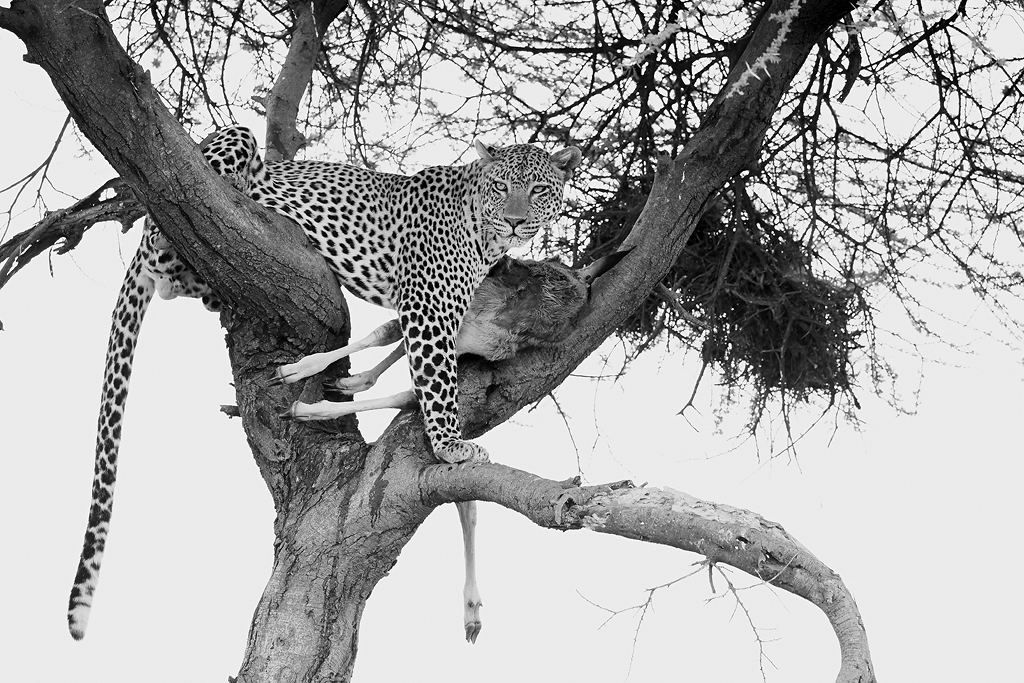
One other facet that working on portraits like this in monochrome brings across is the role of the background. In colour the more uniform and smooth the better, and in terms of tones it is always a major factor in where you want to be photographing your subject from so that the colours compliment or contrast the main subject accordingly. In monochrome this is less critical: it becomes about shades and tones, either conventional in their smoothness such as this Cheetah and in the following example of a Leopard, actually having some texture in the grass provides some additional depth to the image that would have proved a distraction if the image had been presented in colour.


So as much as anything Africa is bringing a fresh ingredient to my observational eye now – thinking monochrome like I used to decades ago when I first started the hobby that has become my cherished profession. And when all the elements of texture, personality, contrast and light all come together it remains as powerful a presentation as it always has.
